brandblog
One giant leap
for ‘brand-kind’

The world watched as the moon
was claimed by Americans.
To be responsible for one of
humanity’s greatest exploratory
conquests is probably the most
successful brand initiative in history.
Cultivate the brand
circle of life

A brand is living entity that requires
management, cultivation, nutrition,
maintenance, and protection.
Gain a complete understanding
of the nature of branding.
Creative executions

This is a guide for anyone involved
in commissioning professional
creative work.
It’s hard to make things go perfectly
right all the time but making things
go badly wrong is dead easy.
“You’ve got to be
good at your job
before you can enjoy
the rest of your life”
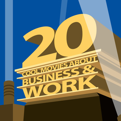
All movies contain some element concerning what people do for a living.
The entertainment value that lies within our fascination for how other’s make their money is undeniable. This is a list of 20 movies that truthfully portray the nature of a job and ethical issues of various kinds of work and business.
The gold standard
of persuasion

Branding is like mining with the hope of discovering a bit of magic. It can be either a big expensive hole that produces nothing much of value or a tunnel leading to treasure.
The five factors for rebranding success
“Let’s not throw the baby out with the bath water”; “We want an evolution not a revolution”; “Don’t try to reinvent the wheel”. These are the kind of cautionary comments that always get bandied about whenever rebranding is discussed. They may all be cliches but perhaps that’s because they all reveal a deep rooted fear. It is not the fear of change. It is the fear of loss. Because if a rebrand goes awry credibility and customer confidence suffers. Plus, a lot of budget gets wasted, first to get things wrong and then to put them right.
Here are my five factors for every rebrand to take into consideration to have the best chance of success:
1. Minimise Risk
A rebrand is speculative, it has the potential to erode as well as enhance a business. Rebranding is therefore a risk versus reward calculation.
In the last fifty years, since “the brand” was identified as a bankable business asset, there have been many world famous rebrands. Examples of these are examined later in this article. What they show is that companies have been surprisingly willing to make huge changes, to take huge rebranding risks in terms of reputation, perception and financial cost.
A seasoned investment banker might advise that the biggest gains come from taking the biggest risks. The corollary being that low risk yields the smallest returns. However, this is not necessarily true for rebranding.
The reason for the disparity within the analogy lies in the nature of brand equity.
2. Retain Equity
Brand equity is the defining factor within any rebranding strategy. With rebranding, small changes can produce big benefits. Whereas, large changes can result in only modest gains or even large losses. Why? Because brand equity is something more than the total spend of the volume of existing customers.
Brand equity cannot be fully described in purely numeric terms. Brand equity has both a logical and an emotional dimension which makes it difficult to quantify. Even with the best conceived and implemented market research, both brand loyalty and brand advocacy, are exceptionally difficult to quantify.
That’s not to say the numbers aren’t important. It is essential to know from exactly where a company’s sales are being generated. Most likely, the eighty/twenty rule applies; 80% of revenues will be coming from 20% of customers. Logically, therefore, the rebranding strategy should focus on the most valuable 20%. Right?
Certainly, rebranding must be devised to retain the most valuable customers but it is probably wrong for a rebrand to pander to them. Rebranding must actually focus on growing the value of the 80% of existing customers. This is because generally it costs less to secure more sales from existing customers than to attract new customers.
A rebrand really must do three things. First: increase income from the largest volume of customers. Second: retain existing high value customers. Third: attract new customers.
In other words, an effective rebrand will not alienate the most satisfied customers but will increase the value of the largest volume of customers.
3. Define Values
To increase the value of a business, the brand must become what the 80% of customers need or want it to be. The brand must also be made more appealing to potential new customers. It’s a complex balancing act.
The true value of a brand lies in what values the brand represents to customers, suppliers, prospects and staff.
Internal perceptions of a brand are important too; the people within a company need to understand the brand and buy into its values if they are to be effective advocates.
All branding falls somewhere on the scale between having ‘some’ small meaning for everyone or having huge meaning for a few; somewhere between the ubiquity of Bic and the prestige of Bentley.
It is not possible to be everything to everyone all the time. Equally, for a service offering, claiming to be great at doing everything is not a marketable proposition. Universal appeal is the antithesis of branding. With rebranding, the choices of what the brand should be and who it is targeted at become more difficult. This is because a company’s customers will be spread out across a wide spectrum.
Rebranding is about bringing the brand back into sharp focus. So by emphasising a defined set of values, some customers somewhere on the spectrum, will inevitably be lost. If this isn’t the case, and customers are clustered into a precise group, then a rebrand probably isn’t necessary.
When considered from these perspectives it becomes obvious that rebranding is probably a more exacting task than creating a new brand from scratch.
Perhaps less obvious is that rebranding might involve something other than a redesign of the visual representation of a brand; an updated logo, a different colour scheme, funkier packaging etc. For a large company, changing all these visual elements can be a very expensive undertaking; to update a corporate identity and to then apply it across everything, from business cards to product packaging from marketing literature to vehicle livery and signage, can also take a long time.
It is the potential production costs of a rebrand that seduces companies into making large changes to their brand in the mistaken belief that a bigger change represents better value for money. After all, production costs are the same to roll out a modest update as a radically different rebrand. This is a massive misconception because in practice a successful rebrand is about values.
The value of a rebrand cannot be measured by what it cost to implement. The value of a rebrand can only be measured in the appeal of the values from which the rebrand is constructed and the success with which those values are communicated.
In fact, in some circumstances, finding a way to help a company reach it’s rebranding objectives may be better served by launching a sub-brand or releasing a new product or devising a new service or constructing a new offer.
4. Respect Heritage
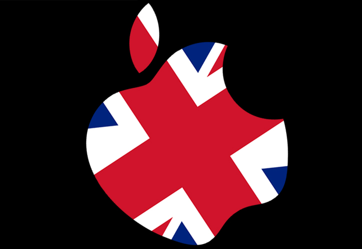
Let me put the proposition to you another way. Think of the Union Jack flag. It is the brand symbol of Great Britain and came into use in 1801. It combines three elements: the Cross of Saint Andrew for Scotland, the Cross of Saint Patrick for Ireland and the Cross of Saint George for England. It is probably the world’s most iconic and ingenious graphic design of a national flag.
From Georgian to Victorian to Edwardian values, the country for which the Union Jack is a symbol, has changed considerably in 200 years. Great Britain has retained it’s brand identity but it’s brand values have shifted considerably.
Great Britain has been rebranded many times by Pitt, Gladstone, Churchill, Wilson, Thatcher, Blair. Each one conveyed different values and presented a different proposition. Each leader brought their own national rebranding campaign, implemented in response to circumstance. Throughout, the core brand identity of Great Britain has remained consistent and consequently the national flag has extraordinary brand equity.
Now consider for a moment that if Scotland had won its vote for independence, some speculated that the Union Jack flag would have had to change; it would have possibly had to lose its cross of Saint Andrew and its blue background! It is hard to estimate how this would have been received on the world stage.
When faced with the challenge of rebranding your company do you want to change flag or change policy? Do you want to alter appearance or change what customers and prospects think, feel and believe?
5. Create Meaning
A rebrand of a business can be achieved without changing the logo.
Rather than risk changing the identity of a brand it can be much more effective to communicate a new and powerful brand story through advertising. If done sensitively there is far less potential risk of damaging brand loyalty.
Brand advertising and branded promotions can be used to maximise brand appeal and create meaning. Advertising and promotions can reposition a brand, refresh a brand, alter perceptions of a brand or test the efficacy of a range of brand attributes.
A rebranding campaign using advertising and promotions is faster to develop and deploy than reworking a brand identity. Advertising and promotions are far more dynamic and flexible marketing tools. They can be used to affect rapid changes in brand perceptions. And they can be tested before being rolled out.
A true rebrand succeeds by developing the meaning of what is being symbolised not merely by modifying the symbol.
The visual elements of the brand’s identity need only be changed if they undermine the meaning or detract from the values of the rebrand. Once perceptions of the brand have been changed and the new business objectives are being met, then the corporate identity can be updated to reflect the shift in perceptions.
6. Rebranding examples: the good, the bad, the ugly, the untouched and the untouchable
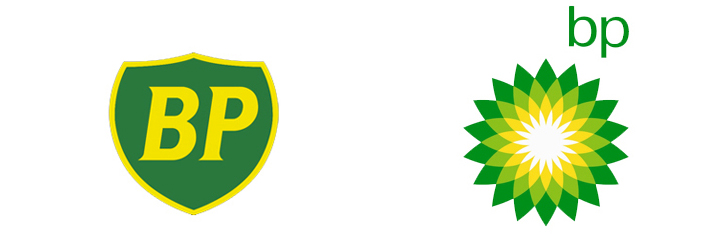
In 2000 BP implemented a rebrand. The shield had high recognition but had been rendered meaningless over the 70 years it had been in use. The company changed the meaning of it’s name from British Petroleum to BEYOND PETROLEUM. The colour palette has been retained for continuity. It is fortunate that green is a pertinent to today’s values. The green sun logo effectively captures what we want an energy company to be. A successful rebrand.
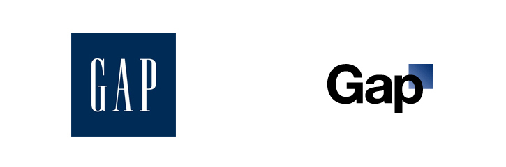
By contrast, it’s 2010 and GAP gets everything expensively wrong. The gap logo had been in use for 20 years, it is an excellent example economical designed, it is distinguishable, familiar, effective. The exact values and meaning of the logo are not overt but its presence on the high street, in advertising and on clothing for over two decades gave it significance for a large international customer base.
But by comparison, the new logo conveys no meaning or values whatsoever. Except to represent a rebranding exercise that was an unmitigated disaster. Somehow the logo managed not to fit or fill any gap in the market and was soon dropped after a reputed spend of £600,000.
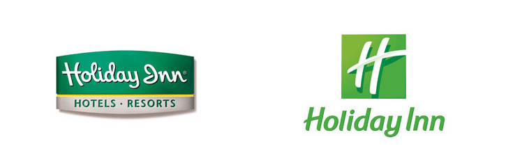
This hotel chain rebrand cost around £700 million to implement. The old logo was definitely old fashioned. The new logo is fresh and contemporary but what does it mean? Do they plan on reducing the name to just “H” or was that done for the purpose of roadside visibility? Will it stand the test of time or will it soon look dated too? Every rebrand means having to give up and lose something. The knack in getting it right is not to lose everything in an outburst of indignant logic as happened with Royal Mail.

Name, colour, styling everything is wrong. The Royal Mail rebrand to Consignia is the ultimate example of: “Throwing the baby out with the bathwater” and then throwing out the bath too! It attempts to “Reinvent the wheel” yet delivers a wall of useless indifference. It is not evolutionary in any way and has insufficient significance to be called ‘revolutionary’. This rebrand is all head and no heart. It totally ignores the heritage, values and equity. Most important of all, especially for the employees who demanded it’s withdrawal, the Consignia brand lacked any authenticity. It was a completely artificial invention. Quite rightly it was ‘consigniard’ to the rebrand dustbin.
Consignia happened in 2001. The same process of “spock-like” naming logic was applied to the next rebrand of a division of a world famous – now infamous – accountancy firm.
![]()
This brand was created in the wake of the Enron scandal. The accountancy firm Arthur Andersen had been responsible for the audits prior to the biggest bankruptcy in US business history and surrendered its licenses to practice in 2002. The firms consultancy arm was rebranded “accenture’. Given its ignominious birth the name is perhaps excusable. It was introduced to much criticism from the business community and today it means little if anything more than it did then. It does not deliver high performance as a brand.
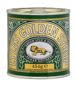
This design for Lyle’s Golden Syrup was created in 1883. It has remained almost unchanged since then. The concept of the design is quite obscure; a reclining (dead) lion beneath a swarm of bees. The image contains a hidden meaning and is drawn from a biblical reference: “Out of the strong came forth sweetness.” These were Samson’s words when he discovered bees had built a honeycomb inside the carcass of the lion he had killed. It’s a great tag line for a sugar syrup. In terms of heritage and values it’s hard to do better than the Old Testament.
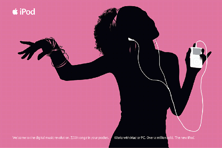
The iPod went on sale in October 2001. The original proposition for the music playing device was: “It’s 1000 songs in your pocket!”
If the movie biography can be believed, Job’s described the iPod as: “A tool for the heart. What it represents is as important as what it is”. It’s a great story.
Four years earlier in 1996, when Jobs rejoined Apple, the company had lost its way and was going broke. A decade later in 2006 Apple was the biggest company and brand in the world and worth $600 billion or £375 billion.
With the iPod Steve Jobs was able to rebrand Apple and pave the way for the iPhone and iPad.
The iPod for Apple represents the most successful and profitable company rebrand in business history.