What can a stare mean
between professional consultants?
Bob Stares is a consultant to architect practices and construction firms.
He works at board level on business development strategy.
He is a seasoned professional who offers a unique combination
of experience, insight and vision.
Bob required a business name, corporate identity, stationery and a website.
It was a relatively small branding task but it had to satisfy the exacting
standards and design sensibilities of top architects.
The building pictured here was created by one of his client firms.

What’s in a name?
A name carries a lot of the load
when designing a brand or corporate identity.
Bob has a reputation for simplifying the most complex issues;
like turning colour to black and white – it is easier to see just the essentials.
From these considerations, the idea emerged of establishing a visual brand connection
to the name “stares” by converting all the photographs to be used into greyscale – “mono” – images.
It is common practice for architects to put their names over the door.
Would that approach work with the name “Stares”?

Negative connotations of “stare” versus its positive brand attributes
The Oxford dictionary defines the verb stare as:
“To look fixedly or vacantly at something with one’s eyes wide open.”
The Cambridge dictionary definition is:
“To look for a long time with the eyes wide open, especially when surprised, frightened or thinking.
Wikipedia have a page on the act of staring and provide this description:*
”Staring is a prolonged gaze or fixed look. In staring one object is the continual focus of visual interest…
staring can be interpreted as… the result of intense concentration…”
The conclusion is the word stares is suitable for the consultancy name.

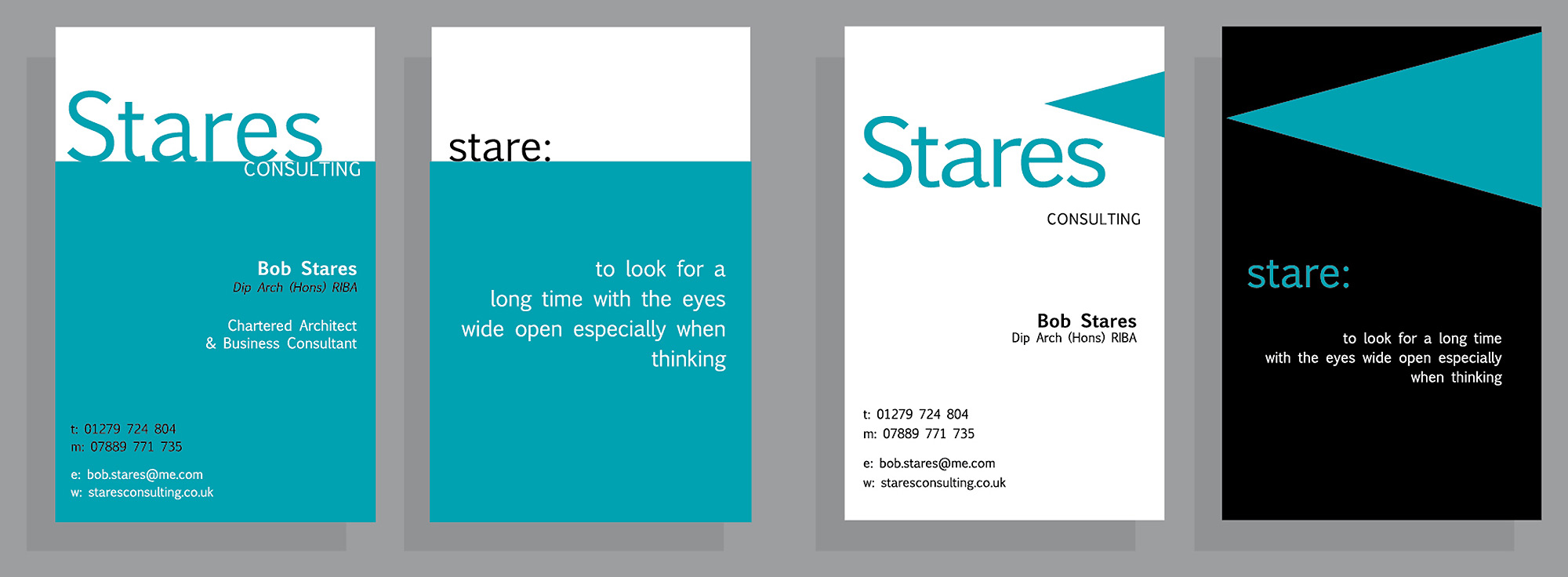
The first impression test
The first sight of the brand for most potential clients would be on the business card.
These first stage concept visuals test the viability of the name and illustrate
how it could be presented in a distinctive and memorable way.
This is achieved by using the definition of the word as a brand benefit
and combining it with a graphic motif that symbolises vision.
What you see here is all that was presented. There was no written explanation or rationale.
It was an important test because – if it didn’t work on first sight – it wouldn’t work at all.

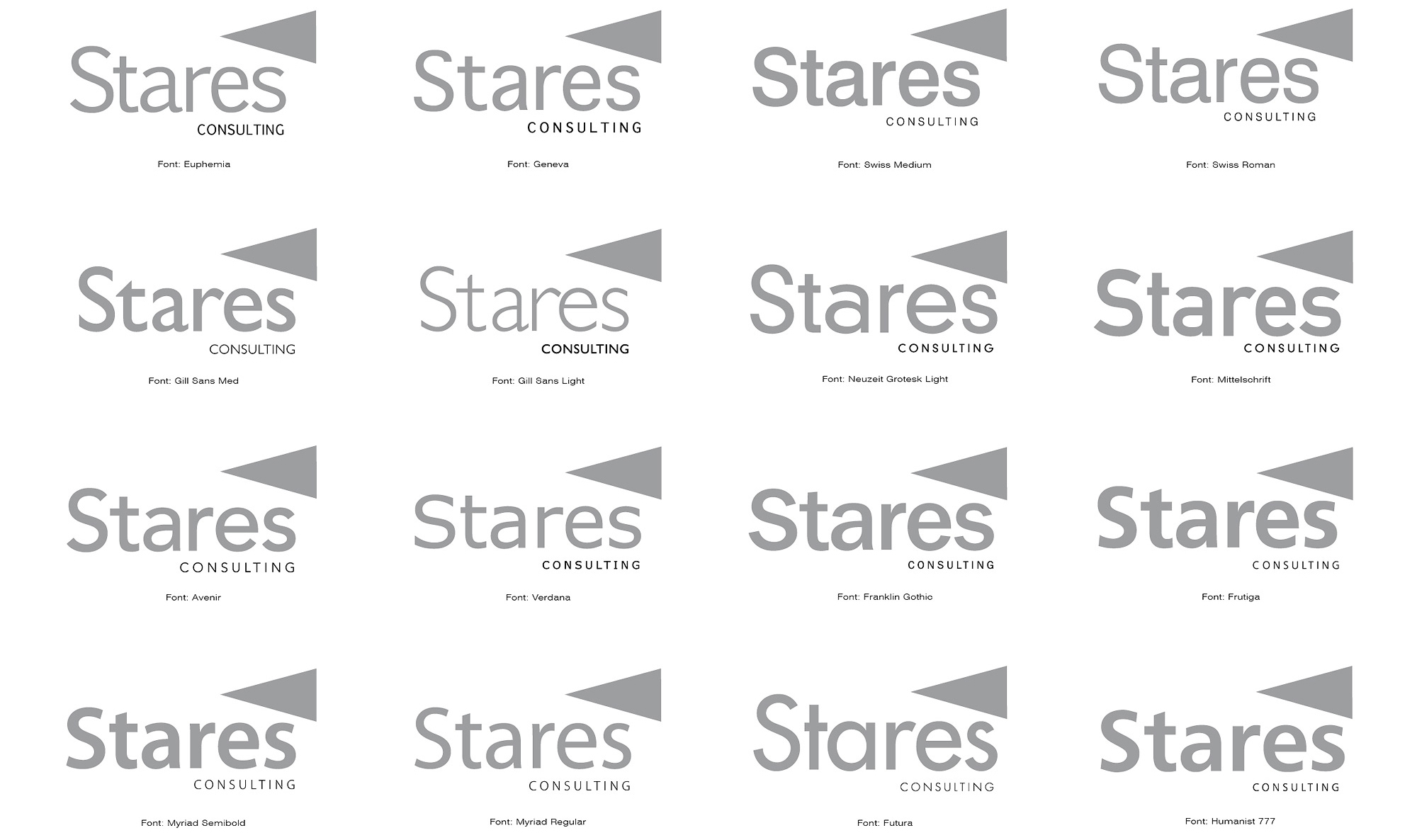
Which font is best for the logo?
With a name of just five characters the shape of those particular characters
must work in perfect harmony and balance with each other to form the basis of an elegant logo.

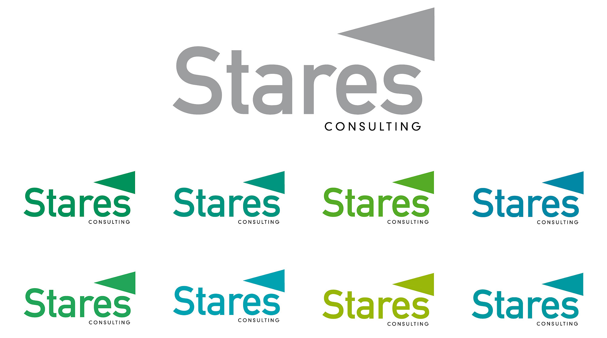
Mittelschift font is selected and tested in eight colours
The upper case “S” of the Mittelschrift font stood out as being exceptionally well shaped.
The client accepted this recommendation and then considered colour.

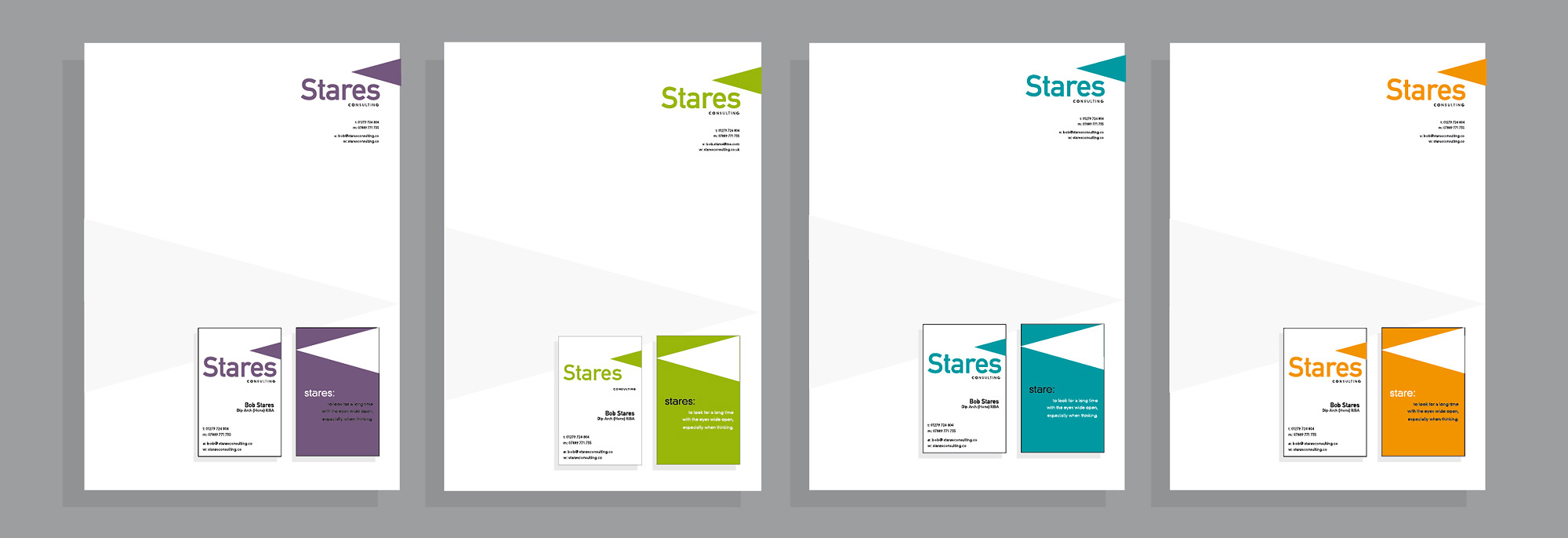
Design elements form an identity
The personality of a company is projected through its corporate identity.
Development is evaluated by applying the design elements; font, colour, iconography
to basic stationery pieces, letterhead and business card which makes comparison easy.

Just seven refinements turn the raw font into a logo
Can you spot them? Scroll to compare
All fonts contain within them a degree of design compromise to ensure legibility.
When use of a font is restricted to just a few characters each one must be scrutinised in relation to the others.
Line shape and letter spacing adjustment is required to perfect the characters to form a logo.

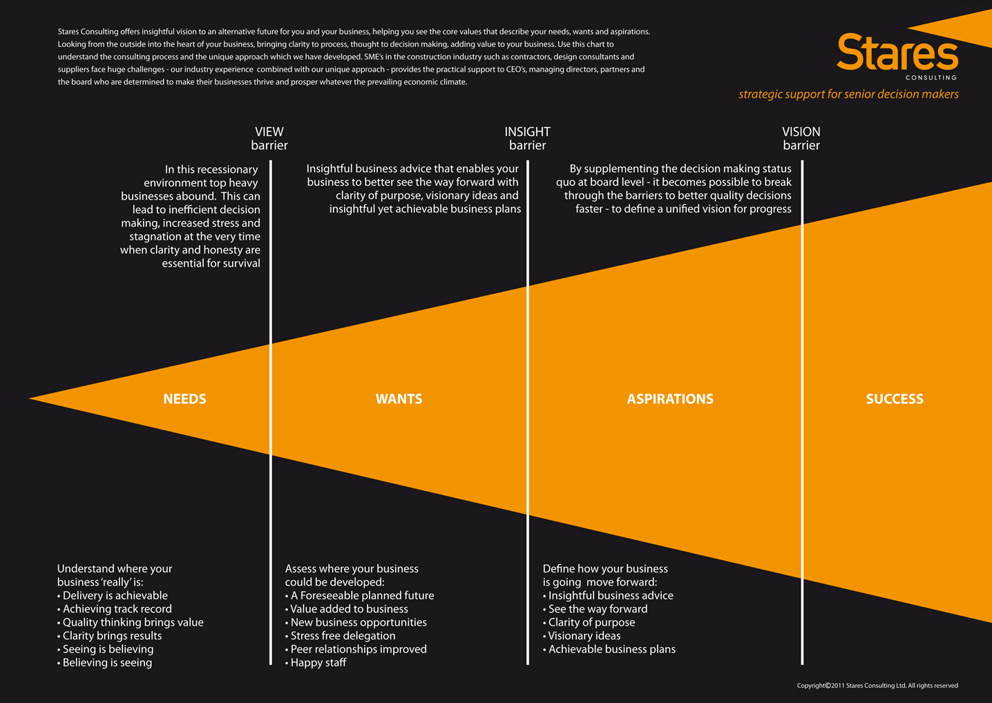
Graphic design makes process synonymous with brand
This simple chart performs several complex functions:
Viewed as an info-graphic it turns the intangible of an analytical and advisory service into a tangible.
It presents the process as a series of understandable stages and benefits.
The design makes clear the meaning contained within the corporate identity
and engenders an intellectual engagement with the brand.

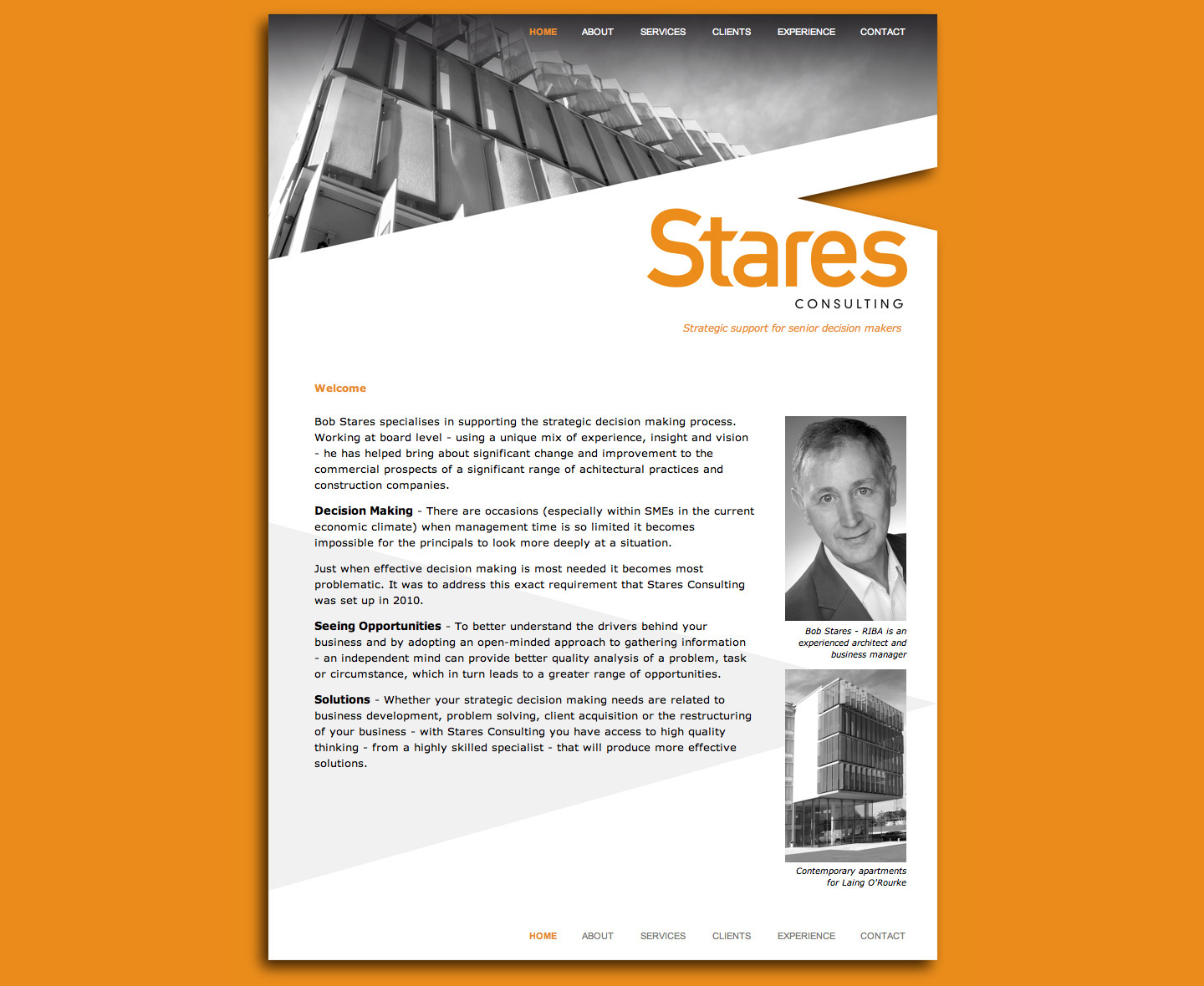
The brand identity is completed on the home page
The new Stares Consulting corporate identity is turned into
a complete brand through the creation of its website.
All the imagery is converted to mono to control their visual prominence,
maintain a unified appearance and convey a distinctive brand style.
In addition, the design element of the triangular ‘vision’ icon is emphasised by the 3-dimensional notch
into the web page. The lateral angle of the icon is echoed in the crop of the header images.
The logo and light grey background motif emulate the watermark effect that is used on the printed stationery.
This level of design synergy and consistency communicates values of professionalism
and control which are essential to the credibility of the consultancy service.
The positioning of the brand is completed with the strapline:
“Strategic support for senior decision makers”

Breaking a brand in two pieces
Knocking on the past to build a future

Sold 300 IT campaigns in 10 years