The branding strength of a simple idea
This highly specialised architect consultancy needed a strong visual identity
to present itself to some of the UK top architect practices.
Initially, the client was considering a new name for the business.
That was until he saw a concept inspired by his own name and how it could be used as the keystone
of a distinctive brand identity; one that’s witty, perfectly relevant and minimalist.
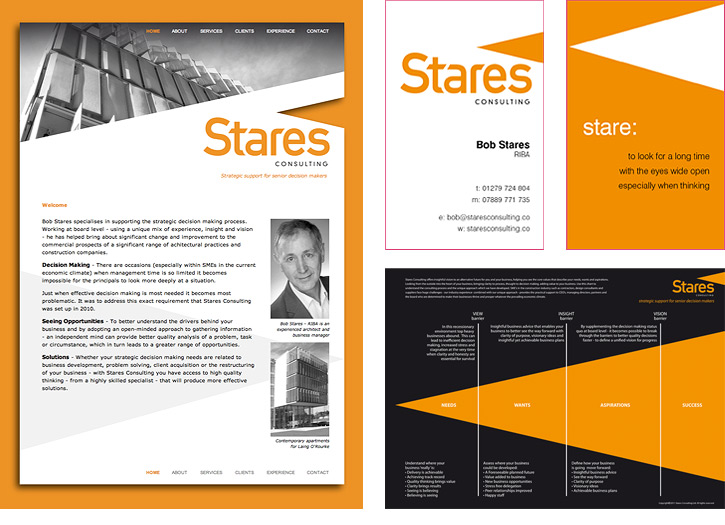
The ‘field of vision’ icon provides the basis upon which all the design work is structured:
the logo, stationery, website and presentation materials. The wedge shape was even used to brand the methodology
deployed by the consultancy. The essential point is that the logo is based on an idea.
It’s not just a decorative graphic device, it has a meaning.
This project reminds me that what may first be seen as a problem or obstacle can often inspire the creative solution.
The icon gives the logo meaning and vice versa, proving the power and the scope of simplicity in branding.