Crafted to convey tradition and inspire trust
![]()
Hylle Royce is a new London based private education consultancy.
It was established to address the needs of international students
and as importantly to satisfy the ambitions of their parents.
The brief was to first devise a name which conveyed an element of English heritage.
And then to create a brand identity which would encapsulate a range of values synonymous
with the UK’s world-renowned private school system.
A fundamental lesson of branding is that there is nothing completely new and unique.
Instead, there are new and unique combinations. So it is with Hylle Royce;
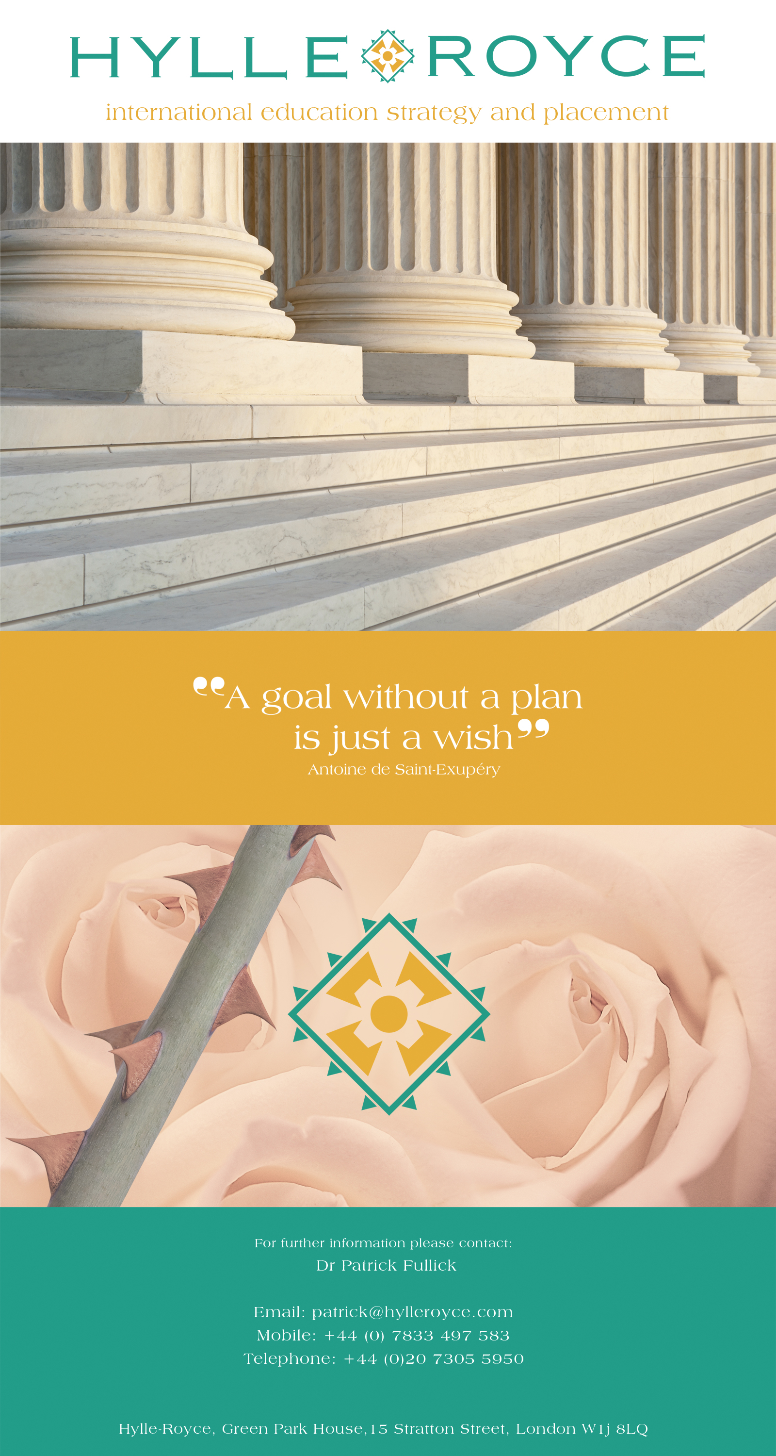
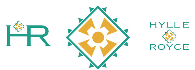
the formation of the name actually started with the idea of using an English heraldic rose as the brand symbol.
The brief stated that mothers, not fathers, are the primary decision makers
in providing the best education for their children.
The rose and thorns seemed to perfectly symbolises the risk and reward nature
of selecting the perfect school for their child. By some good fortune the latin word for “rose” is royce.
It is also translated as “regal”, “son of the king”, and “royal.” The thorn surround of the rose symbol
is a modern graphic twist on the heraldic heritage.
The name Royce is universally synonymous with quality.
The word Hylle was selected because it is unusual in its spelling, the letter ‘e’ makes it look like Olde English and because
it has five letters it makes the logo symmetrical.
Research confirms that the brand identity is especially appealing to mothers without alienating fathers.