Moulding heritage
into a contemporary brand
The brief was to create a brand for the business that would position it to appeal
to the top end of the market of private home owners, architects and building contractors.
It was also of vital importance to the owners that the new brand would have
a strong appeal with their highly skilled workforce of carpenters and fitters.
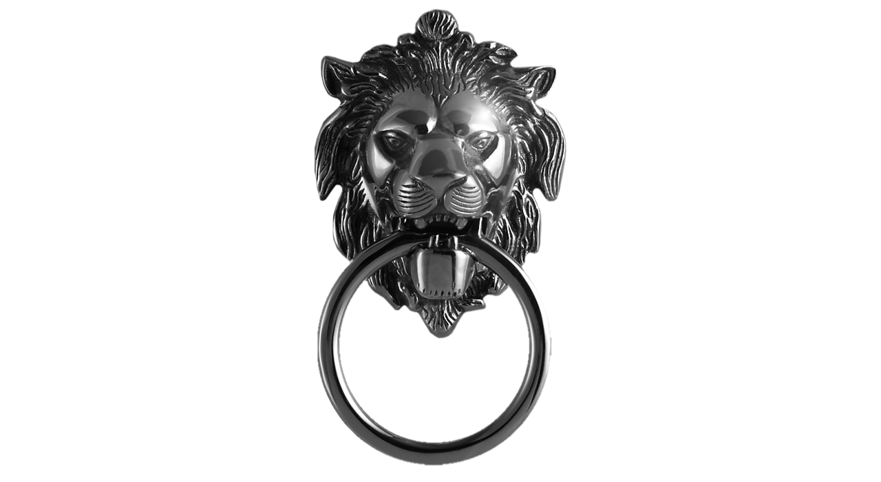
The starting point for building the brand identity
was inspired by the iconic lion door knocker
The Original Wooden Window Company use a combination of traditional carpentry skills
and the latest up-to-date technology to manufacture traditional windows and doors.
The company is a family business and was started in the years after the war in an area of the country
that contains a large proportion of grand Victorian and Georgian estates.
Values of heritage, tradition, craftsmanship and quality are intrinsic to the brand.
Extensive research identified one object that embodied many of the values the brand required.
The lion head door knocker was introduced in the Georgian period of architecture.
It was a development of the gargoyle which had been used to embellish earlier Gothic buildings.
The front door of 10 Downing Street has a black lion door knocker.
It’s purpose is to protect and ward off evil spirits.
The lion has a long and strong history in branding
The lion is a long-established symbol of strength and superiority.
It appears in heraldry going back to an England of Knights and chivalry.
However, the current market also demands that windows and doors meet modern standards
of thermal efficiency anddurability. The new brand would have to convey both tradition
and modernity; to communicate heritage and appeal to contemporary tastes.
The challenge in answering both sides of the brief was to find
an original and modern way to represent the iconic emblem.
From the Royal coat of arms to the national rugby team, from the Peugeot Cars marque
to the MGM movies trademark, the lion has provided the basis of a complete logo.
Unfortunately, the lion didn’t do enough to answer our branding requirements.
The sun icon symbolises light and warmth
The symbol of the sun is universal and it’s drawn or carved representation dates back to pre-history.
From the pagan to the Egyptian, from the Vatican to the Amazon, from the Japanese national flag
to gates of the palace of Versailles the sun appears in many decorative forms.
Apart from the Sun Records label of the 1950s, the motif of the sun has not
formed the basis of many company logos.
Its most ubiquitous application is for holiday and travel businesses. However, Sun Microsystems,
which at its peak was worth around £5-billion, did not use the sun as its logo.
In recent years, the advancement of solar power has seen the sun symbol being used more frequently
by companies in the sector. These values are most prominently seen with
the BP green sun brand iconwhich was introduced in 2000.
This broad exposure has imbued the symbol with values of efficiency and environmental responsibility.
The sun image says friendly, positive, enduring and modern .
Sun or lion: which would you choose?
Both lion and sun symbols answer the requirements of the branding brief.
Both have been used extensively and successfully to brand a wide range of institutions,
organisations, companies, sports teams and even countries.
Will The Original Wooden Window Company brand
be best represented by a lion or sun symbol?
Combining both is better
Neither sun symbol or lion icon met the needs of the brand.
But combined the lion with a sun mane symbol is more than the sum of its two parts.
The new symbol is unique, distinctive, appropriate and conveys all the brand values required of it.
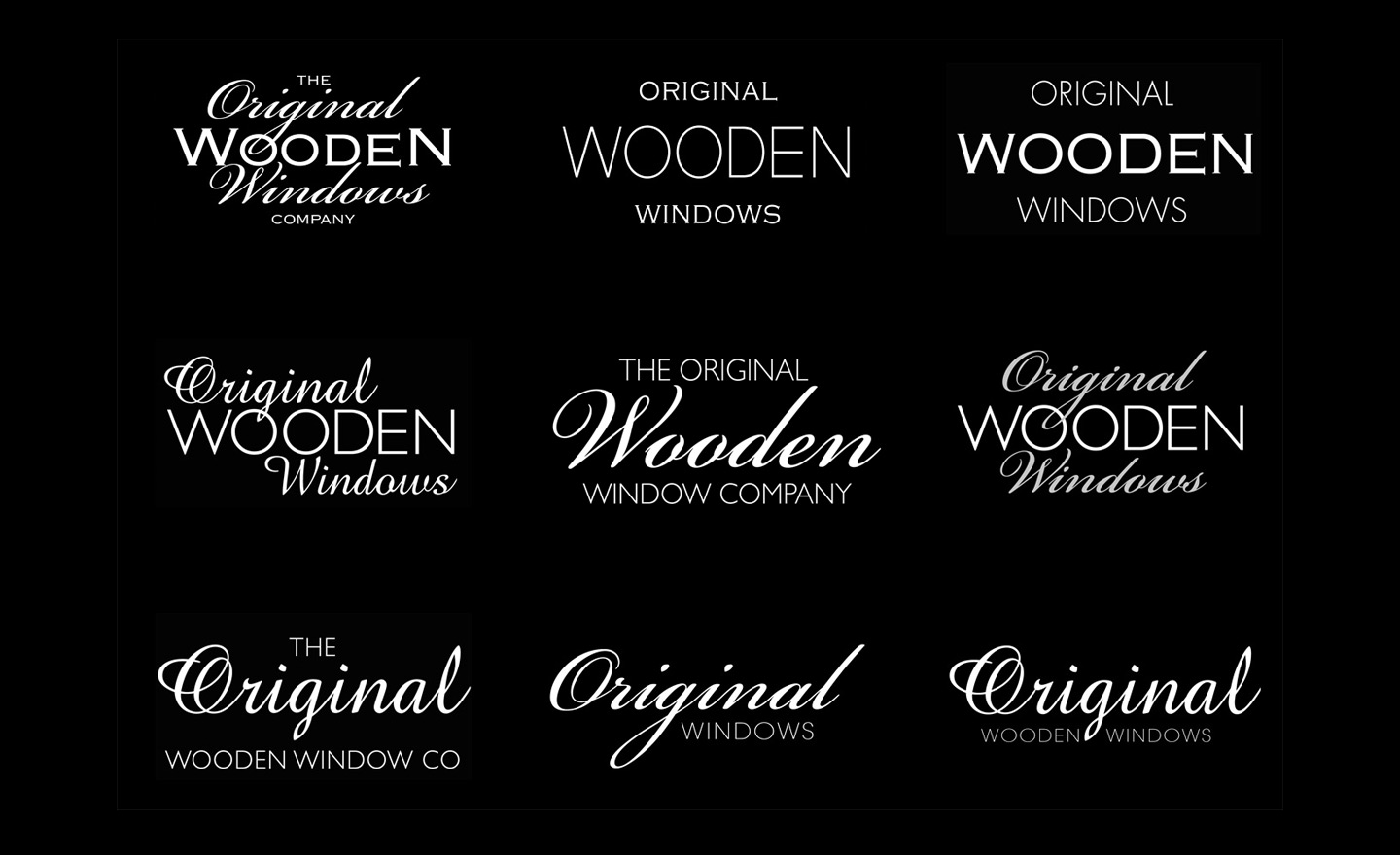
Finding the best form of the name required careful testing
The Original Wooden Window Company is a long name to work with.
In most instances, companies with long names reduce it to initials, for example, BP, IBM, QVC, ICI.
That technique would not work in this instance: OWW would never work even with the sun lion symbol.
The task became one of choosing the best emphasis and typographic treatment.
The brand benefit of going with the flow
Using the words “wooden” and “windows” was too restrictive.
The company is most frequently referred to as simply “Original” so emphasising just that one word simply
formalised this expression of the name. In branding it often pays to go with the flow.
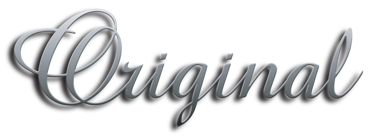
This script font is derived from traditional quill and ink calligraphy. The 3-dimensional moulding provides a sense
of 1950s styling. This highly refined design treatment met all the business and brand requirements.
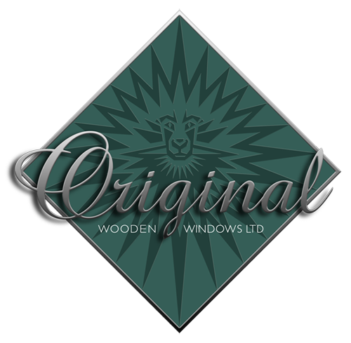
Symbol, script and name combine
to form a compelling trademark
The company’s existing logo was diamond shaped and so this was retained.
It proved to be the most suitable and appropriate structural form
onto which the elements of the brand could be composed.
More dynamic than a square or rectangle, more striking than a circle or oval.
The diamond shape holds all the elements together and adds an extra depth of meaning and visual impact.
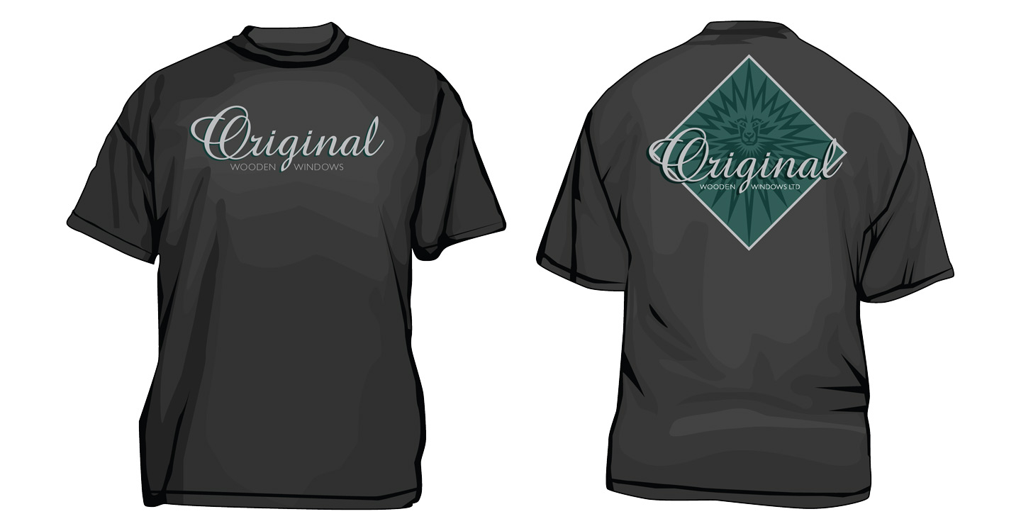
Graphic design conveys brand values but it’s
employees who personify it as brand ambassadors
Making and fitting windows is a very personal business.
Original’s team of skilled carpenters, glaziers and painters hand-make the windows
at the company’s workshop facility.
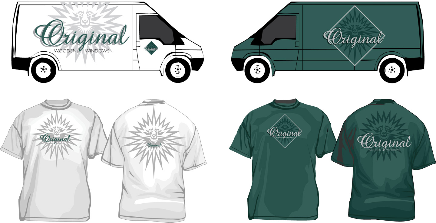
The fitters will be working in a customer’s home for several days the company’s van parked on the driveway.
It is in this situation that the brand is brought alive and given meaning.
Original’s management, the staff and the customer must all feel proud
and invested in the new Original livery.
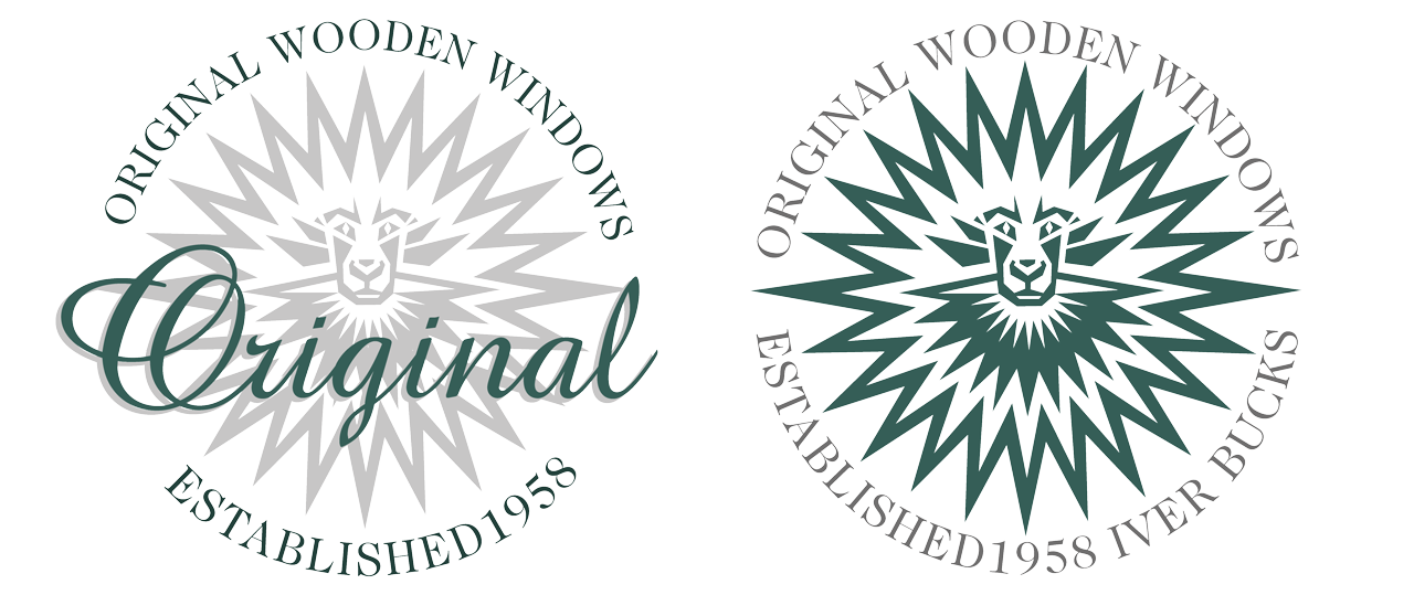
Company heritage and product authenticity are sealed
Since the Middle Ages, the wax seal has been used on letters and documents to verify
the identity of the sender and that the correspondence had remained unopened until received.
Today the wax seal is used more for ceremony than security.
The logo has taken over that role. A logo is stamped onto our luxury products as proof of authenticity.
With the most powerful brands the logo is also symbolises pride of ownership.
These seals were created to perform all those functions and to add credibility
to the company’s long and successful trading history.
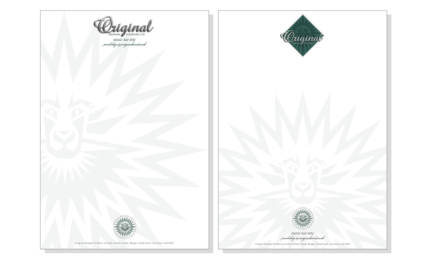
All of the branding components are brought together
on company stationery to create a complete brand identity.
Putting a spin on the militaristic phrase; branding is a weapon of mass seduction.
For company’s like Apple, Coca-Cola and Nike it definitely is that.
But branding can be used just as seductively on a
personal level for smaller enterprises.
The branded brochure is a powerful marketing tool
It is not a new concept to drawn comparisons between war and business.
Anyone who runs a business knows that they are in constant conflict with the competition.
The battle is for market share and profitability;
the constant dilemma between is between fighting on price or trading on quality.
Branding can be deployed to implement either a cost of quality strategy.
Most of all branding is capable of communicating value – and values – which are
both core requirements to attracting and retaining customers.
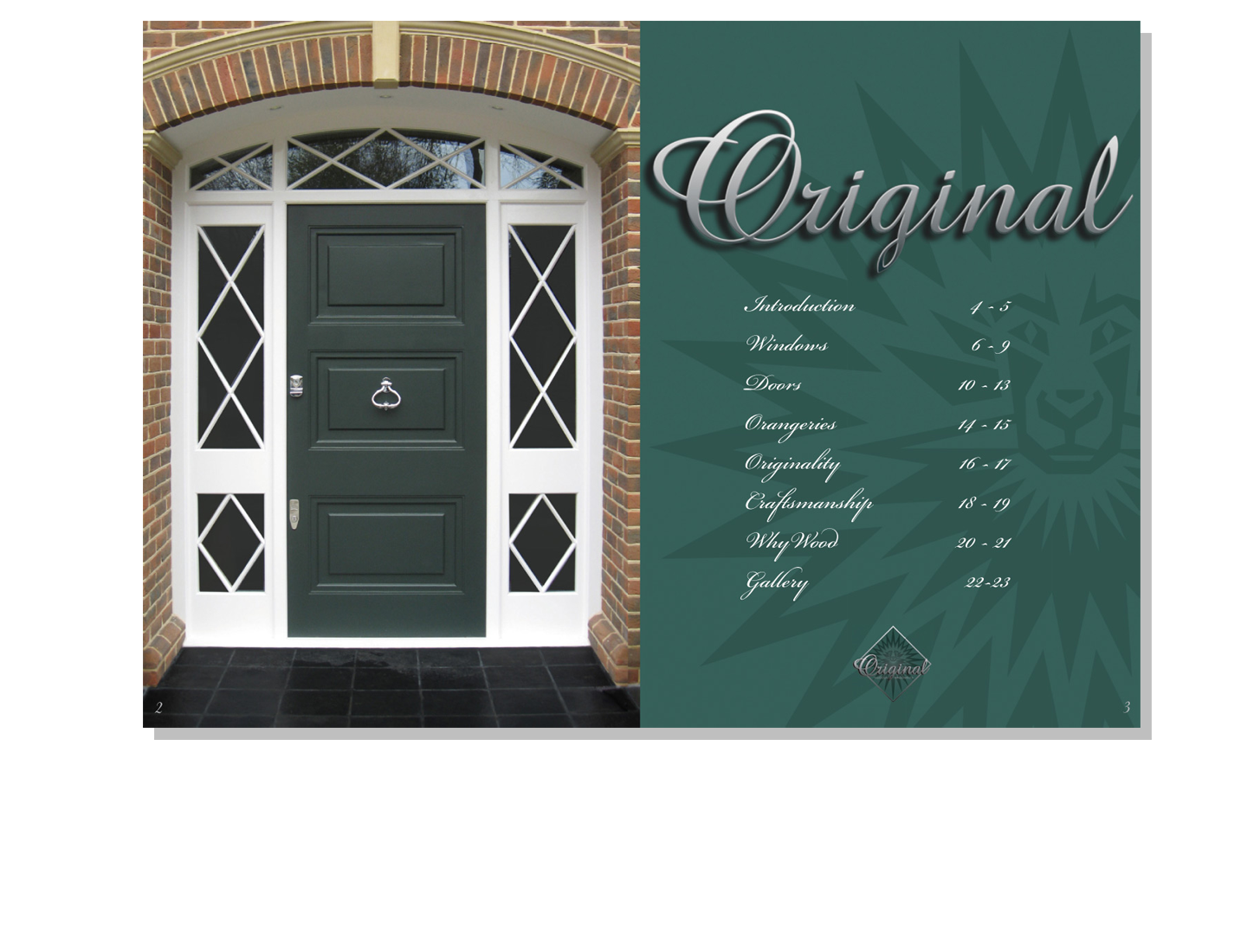
This concept visual for the Original brochure puts all of these marketing and design principles into practice.
The organisation and refinement of the content will form the basis of a website design and build.
