Name dropping to create instant
brand appeal and universal recognition
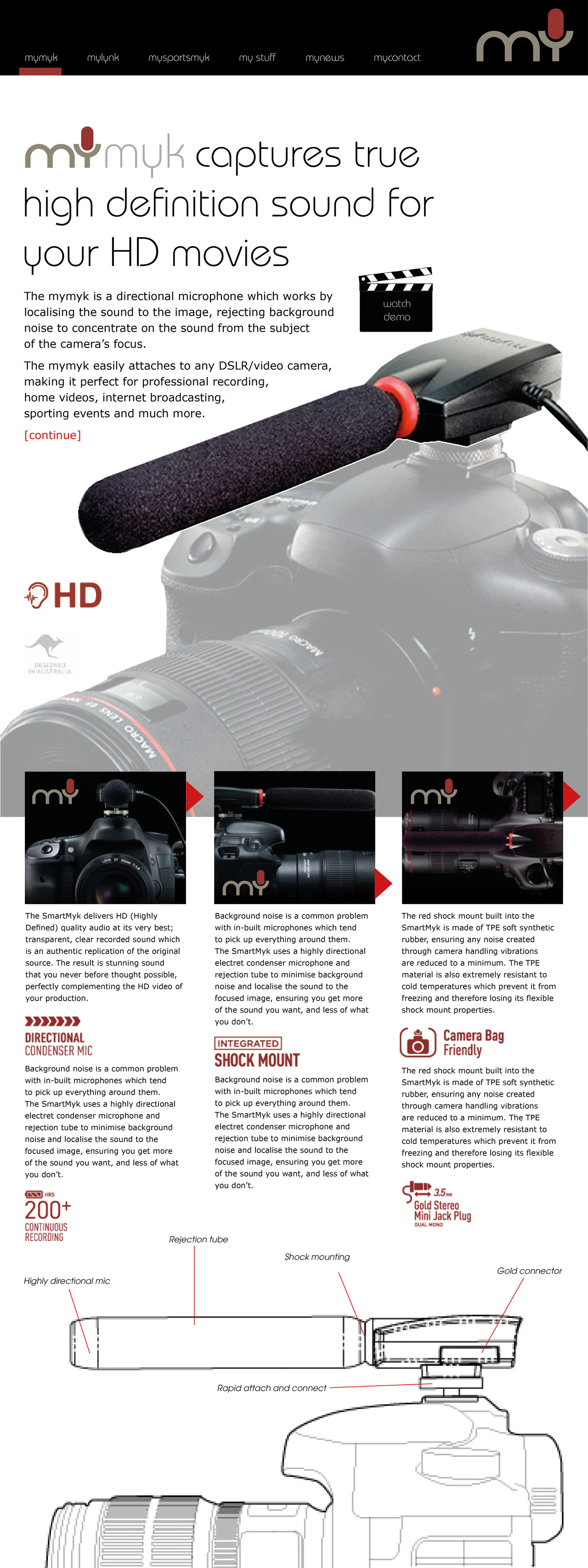
MyMyk is a recently established company based in Sydney that has developed
an innovative range of sound recording products. The first to market was a mic system
that effectively converts a digital SLR (single lens reflex) camera into a video camera.
This successfully positioned the company as a niche brand for the professional
and serious amateur sector of the market.
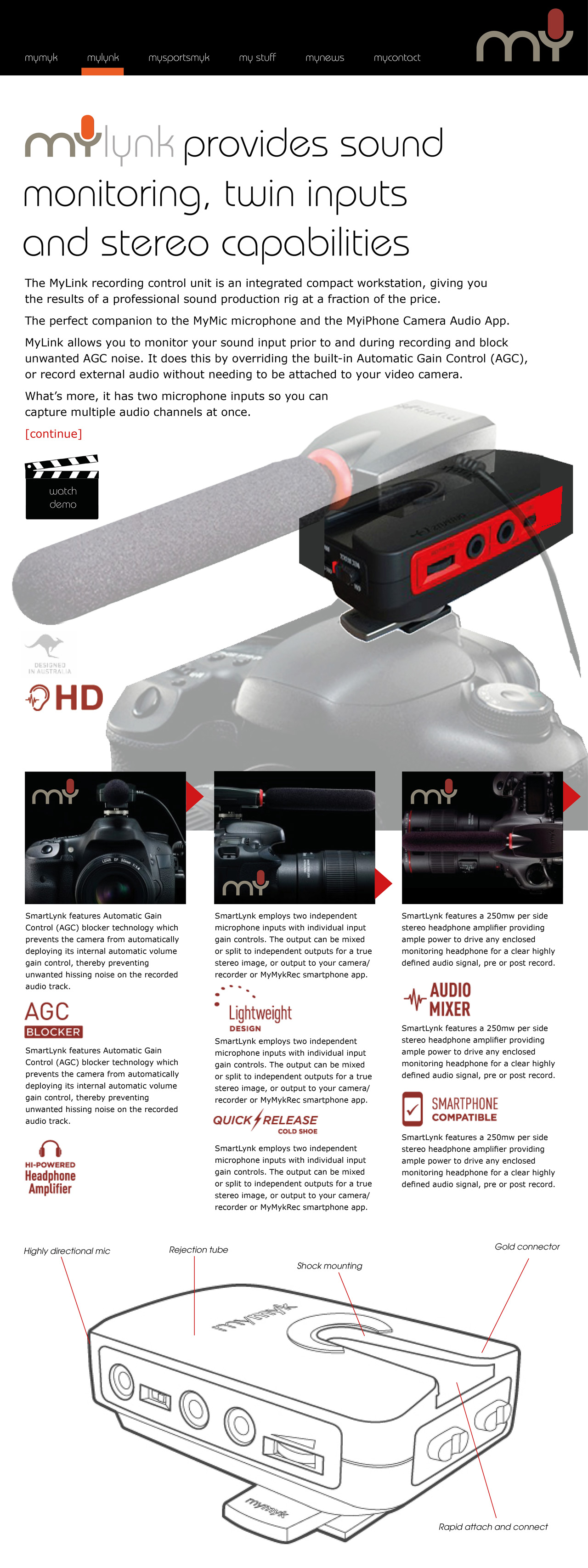
Having gained a commercial foothold it became apparent that the continued growth of the business
would be dependent on appealing to a wider consumer audience. To this end, the company
had leveraged its audio technology to develop a recording application
for the iPhone and a range of hardware accessories.
The first part of this task was solved by dropping the prefix ‘Smart’ and by de-emphasising ‘myk”
to focus attention on the word “MY” for both company and product naming.
Brandgarden then by conceived a logo that communicates microphone in
every language by utilising a universally recognised symbol.
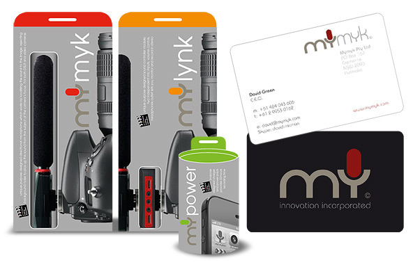
The above pack concept visuals were not intended for production but rather
as a reference point from which to examine re-positioning the existing MyMyk brand.
The designs illustrate how a new creative treatment to the brand name would have potential
mass appeal for the wider audience of GoPro and other action camera video makers.
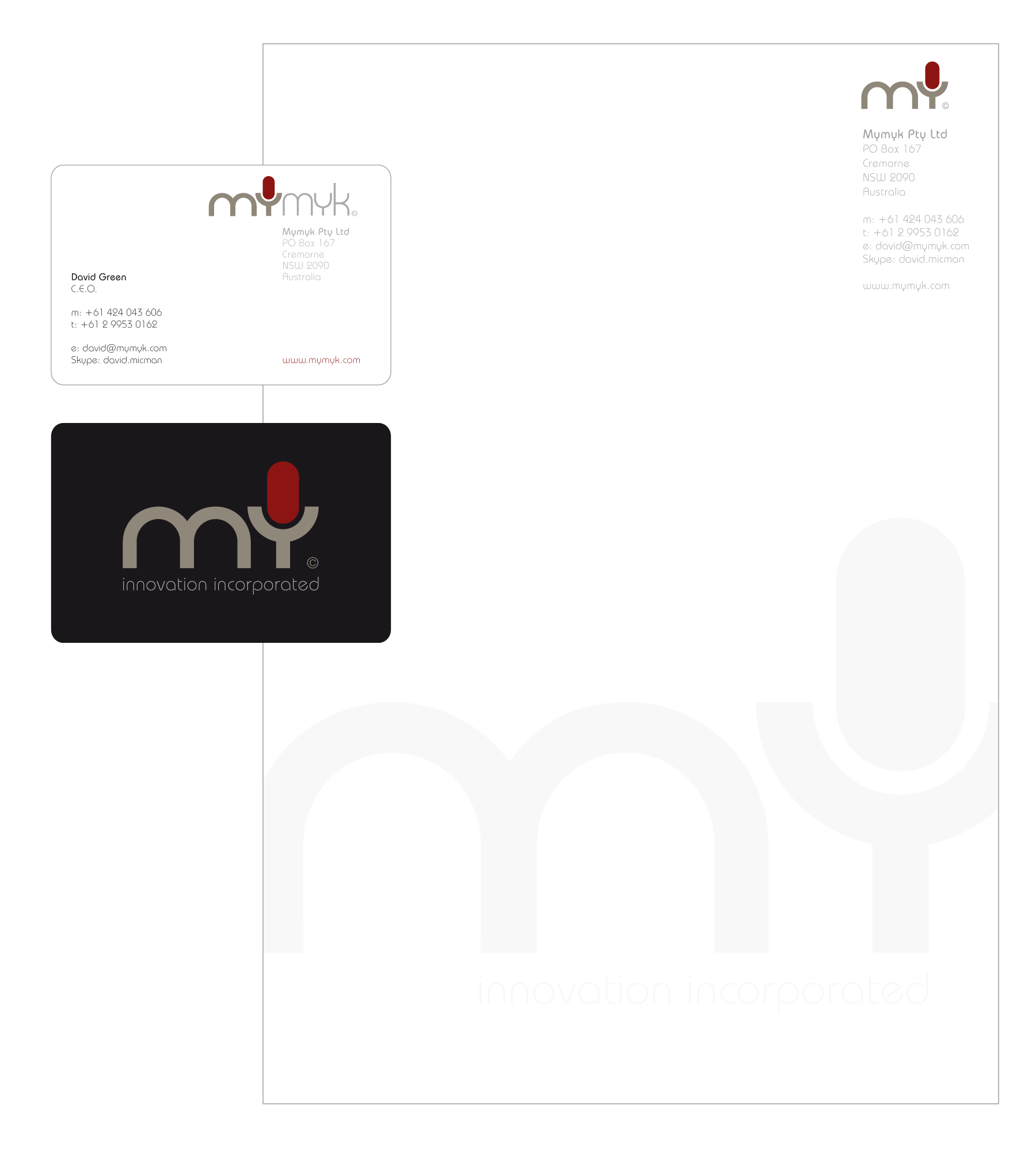
The business card design illustrates that it would not be necessary to change the company’s name.
And the new brand treatment was not intended to be applied to existing products.
The purpose of the MY development was to convey a new brand image
and values to facilitate penetration of broader consumer market sectors.
This planning and branding work was followed by the development
of a close-mic (shown left) which has just been released under the name sportsmyk.
The other striking advantage of the MY icon logo is how well it sits on products with tiny surface areas.
The appeal of the work is probably best summed up in these comments from the client:
“We really appreciate the outstanding service you have provided.
Your branding concepts, communication and efficiency are remarkable.”
Ingrid Shears, Managing Director MyMyk Pty Ltd.
Pictured below is MyMyk’s existing logostyle and flagship product
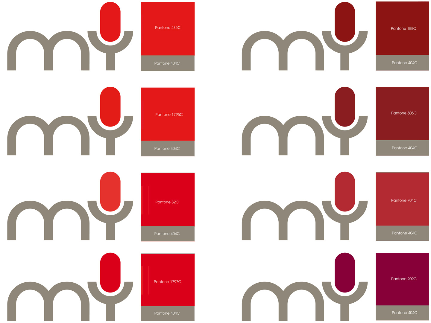
Colour tests were done to select the best red for the main logo
Design visuals evaluate icon and font selection
in the context of the company’s corporate identity
The new brand scheme required a full colour palette
and several alternative fonts were tested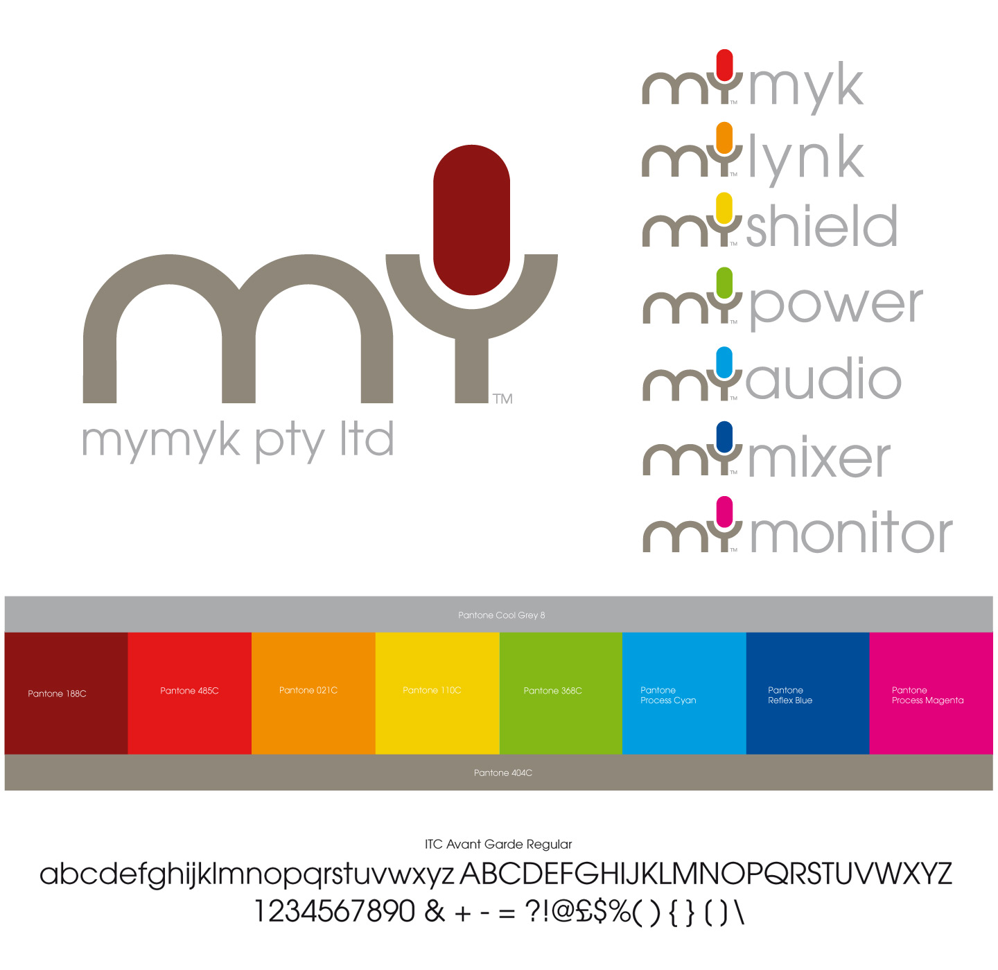
My, my, my…
recognition from a prestigious design community
Brandgarden’s MY Audio Logo has been selected by the global creative platform DesignRush for inclusion in their Best Brand Logo Designs showcase — a curated feature celebrating outstanding identity work from around the world.
DesignRush connects over 800,000 monthly visitors with leading creative agencies and recognises work that exemplifies innovation, clarity, and brand impact. This selection places Brandgarden alongside top-tier international studios — an endorsement of our commitment to creating identities that looks as good as the products they brand.

The new “my” brand styling was applied
to the design of the website