Navigating to a new identity for a luxury yacht
If handled correctly the combination of the most disparate components can produce truly striking results.
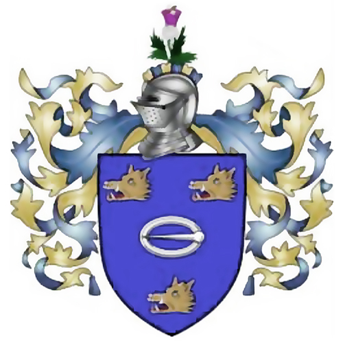
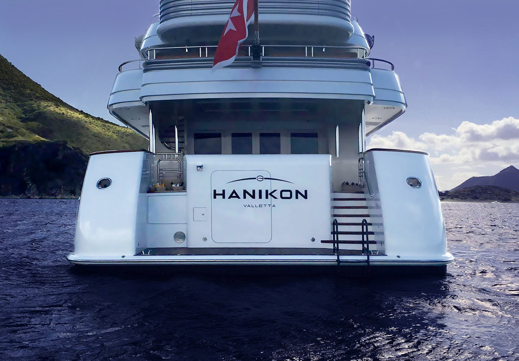
This identity for the luxury yacht Hanikon brings together a left pointing buckle symbol taken from the owner’s family crest,
a horizon to represent ocean travel and adventure and the bold cut of the Eurostile typeface
most often associated with technology brands like JVC and the livery on police cars.
It was a challenging and exacting design task to refine the shape and balance
each of the font characters to convey the desired impression of strength, luxury and presitge.
Then a range of icon ideas were explored, evaluated and discarded before finally selecting the horizon motif.
Finally, the buckle symbol; at the beginning of the creative process this seemed like an insurmountable design problem,
but in practice the heraldic buckle symbol provided the perfect finishing touch to the new identity
and delivered a direct and personal link to the owner’s heraldic family identity.
New ownership and a tight schedule
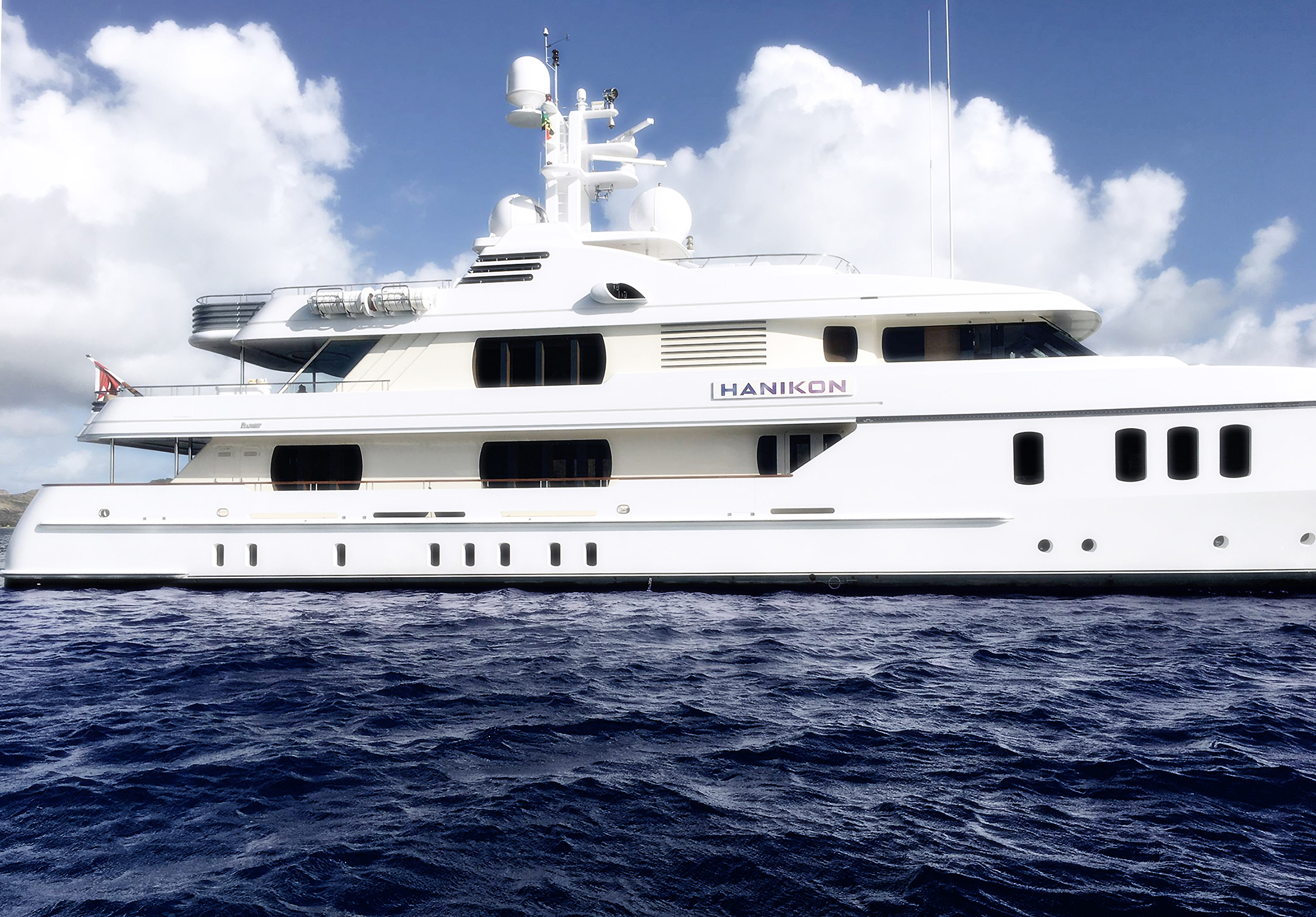
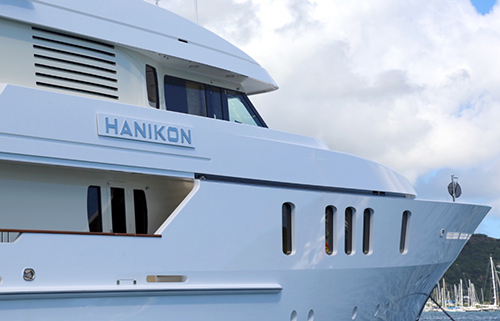
The 50m Feadship motor yacht HANIKON went into new ownership at the end of last year’s busy Mediterranean season.
The schedule was very tight for re-flagging and re-branding the yacht in time for her Transatlantic passage
and a full upcoming Caribbean charter calendar.
Having worked with Glenn during my time as Sales Director at YCO, I knew I could count on him
for a fast response and a high quality job. The greatly-improved look of the yacht
and the evident delight of the owner are enough to validatate that decision.
We will certainly use Brandgarden again.
Neil Cheston, CEO, Flag Yachting Monaco
Design choices
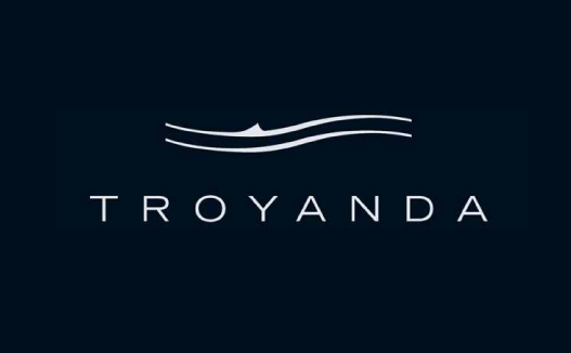
The yacht had previously sailed under the name Troyanda shown below.
The new owner felt that this identity did not have sufficient visibility on the yacht’s 3-meter long side name panels
and it was judged that a much bolder typeface was required.
![]()
![]()
The brief for development of Hanikon’s new identity contained a suggestion to use the font Eurostile.
To establish if this was feasible the font was tested and compared against a range
of alternative sans typefaces in a variety of stroke thicknesses.
Each font that was examined provided a number of design cues to customise the shape of each one of the letters that make up the new logo.
The objective was to find every means to move the font away from looking utilitarian and towards conveying luxury.
The brief also specified that for general marketing and branding purposes (for example brochure, merchandise, online etc.),
it was desirable for the new bolder identity to contain a pictographic element, ideally to be derived from a reference to the sea.
In addition the client also very much wanted to include the buckle motif from the family’s crest.
The documents below show the many design options that were methodically explored and evaluated
to arrive at the optimum identity and to fully answer all the requirements of the brief.![]()
Font Selection
https://www.brandgarden.co/wp-content/uploads/01-Hanikon-Font-Selection.pdf
Logo Development
https://www.brandgarden.co/wp-content/uploads/02-Hanikon-Logo-Developments.pdf
Icon Tests
https://www.brandgarden.co/wp-content/uploads/03-Hanikon-Wave-Buckle-Icon-Tests.pdf
Final Logo Configurations
https://www.brandgarden.co/wp-content/uploads/04-Hanikon-Final-Logo-Design.pdf
Final Logo Options
https://www.brandgarden.co/wp-content/uploads/05-Hanikon-Final-Logo-Options-E1B-OR-E1C.pdf
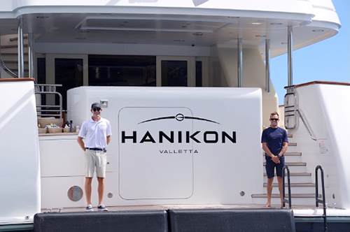
A technical and aesthetic challenge
The elegant lines of the yacht provided two long narrow nameplates on the sides of the vessel.
Therefore the only position on the yacht where the new Hanikon logo could be shown in it’s entirety was across the stern of the vessel.
This position is especially important as it is the dockside view when the yacht is moored stern-to which is
a regular occurrence, in the most exclusive ports in the world, when image is everything!
The difficulty is that on Hanikon the transome door is offset to the left/portside of the vessel.
The design and production challenge was to find a means to scale and position
the logo to be as large as was possible whilst also being perfectly centred.
The attached document shows the precise calculations necessary to achieve a perfectly balanced end result.