How can brand advertising
change perceptions of apprenticeships?
Apprenticeships had been losing their appeal since the 1960s.
The success of recruitment into higher education had led to a shortage of skills
across every industry sector. Apprenticeships were seen as a sub-standard education
and career path. And many trades had the reputation of being race and gender prejudiced.
My client is a government funded nationwide youth training initiative.

Branding works to change perceptions
when the problem becomes the heart of solution
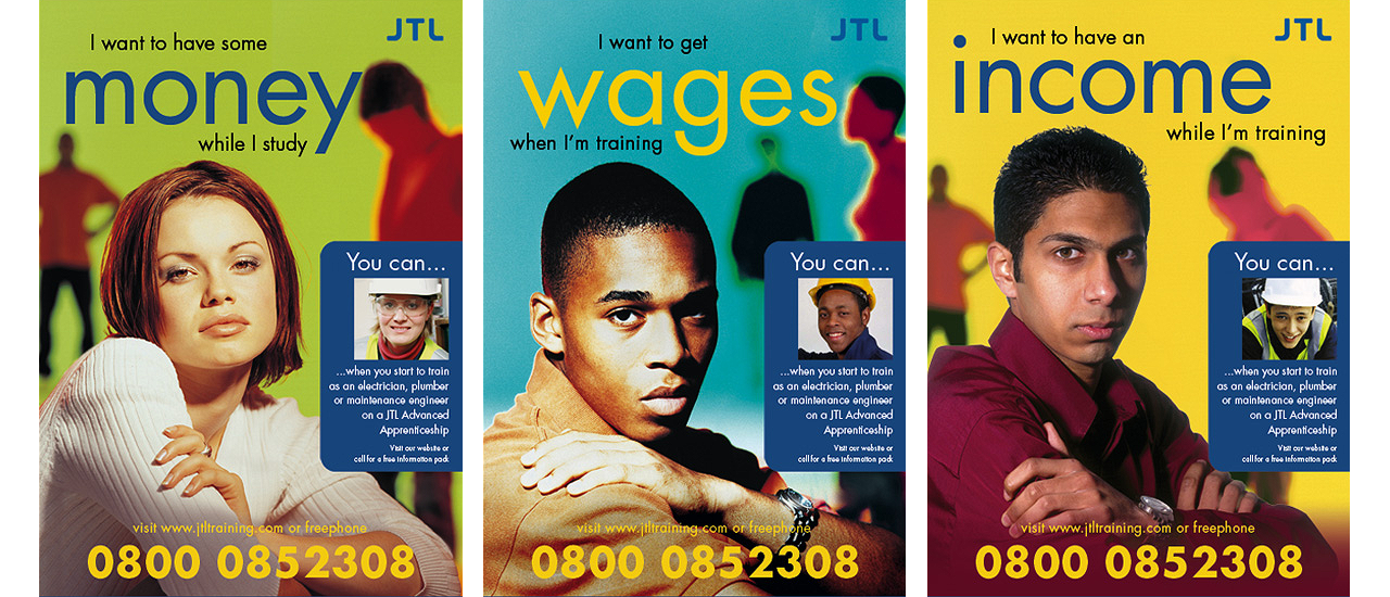
Appealing images and high production values create a fresh and contemporary brand image
which immediately dispels the notion that apprenticeships are old fashioned.
Real life testimonials then add credibility to the core proposition: “earn as you learn.”
Most important of all, equality of creative approach, conveys and demonstrates the message
that apprenticeships provide equal opportunities for all. Addressing young people of both sexes
and different ethnic groups in the same way is part of the solution.

Confidence is a consistent brand personality
Having attracted potential apprentices, applicants are assessed and then matched with suitable
employers in their area. The same brand personality must be sustained throughout the entire
induction process and across all literature to maintain confidence for children and their parents.
Outcomes are judged by the host companies on purely commercial criteria and quality of apprentice
applicant is synonymous with quality of the brand.

With branding, familiarity breeds consent
Presentations in schools, at careers fairs and events
are essential recruitment channels to attract young people.
Branding works by creating a sense of security.
Posters, advertisements, literature, pop-up stand and contact card,
all convey the same propositions and display the same content.


The essence of the brand
distilled into three letters and four words
A set of three initials is a well proven business naming formula.
In considering the main corporate identity component, the logo, it is usually
styled to address a single cohesive audience. In the instance of JTL however,
it had towork for two totally different audiences with equal appeal;
business owners had to see it as professional and prestigious whilst
apprentices and parents had to see it as friendly and accessible.
The combination of a round cornered sans font and perfect symetry has literally
achieved the perfect balance. Supported by a strap-line that is a promise and a
benefit to employers and apprentices alike.

With insight and a bit of humour
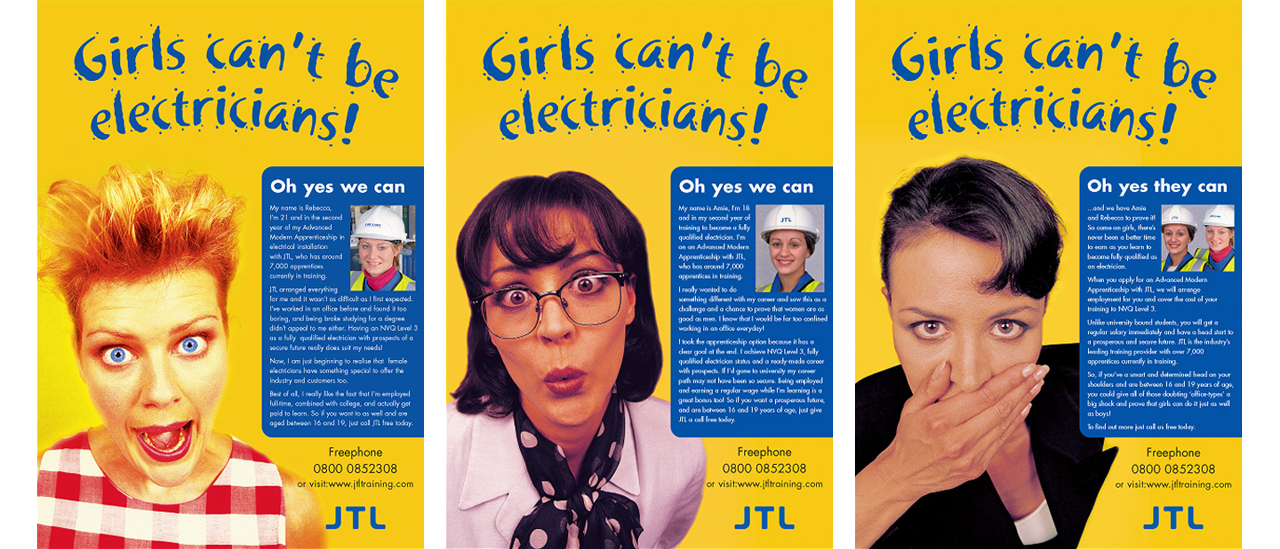
a brand can confront gender stereotyping head-on
Research showed that potential female apprentices were being put off
from applying or even dropping out from training because of ridicule;
not from employers but sadly from their friends and family!

This outdoor campaign was a public
challenge to sexist attitudes
This approach was inspired by one of the most famous direct response press advertisements
of all time: “They laughed when I sat down at the piano but when I started to play!”
It was created by John Caples the Madison Avenue copywriting pioneer in 1926.
I have won a John Caples creative award and this was my way of paying tribute; to use what I learned from his work.
It is not often that a brand has the opportunity or courage to be so confrontational. In this instance,
it was not merely justified but a very powerful demonstration of the brand’s value.

It proved to be an effective
recruitment campaign


Land Russian spacecrafts in London

Make a dog wind-surf and sky-dive

Scrutinise the professional Stare