A healthy dose of branding
for a probiotic food supplement
Bio-Kult was an existing low-profile niche product
when Protexin Healthcare bought the manufacturing rights.
Brandgarden was asked to develop and implement a full rebrand and relaunch initiative.
The approach was briefed to be ‘evolutionary’ rather than revolutionary and built on Bio-Kult’s
existing brand assets and identity. In design terms Bio-Kult didn’t have much to build on.
Core to the design task was to
retain key elements of the original label
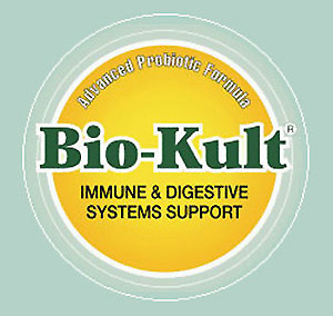
The original Bio-Kult label pictured here is extremely basic and naive. In some situations,
these perceived attributes can be benefits; for instance, for a charity that cannot
look like it has spent too much on marketing and presentation.
The Bio-Kult product had a good reputation. It required a professional identity with strong consumer appeal
to compete in a market with generally high standards. To maintaing continuity it was decided
to retain the feel of the name type style and the colour scheme.
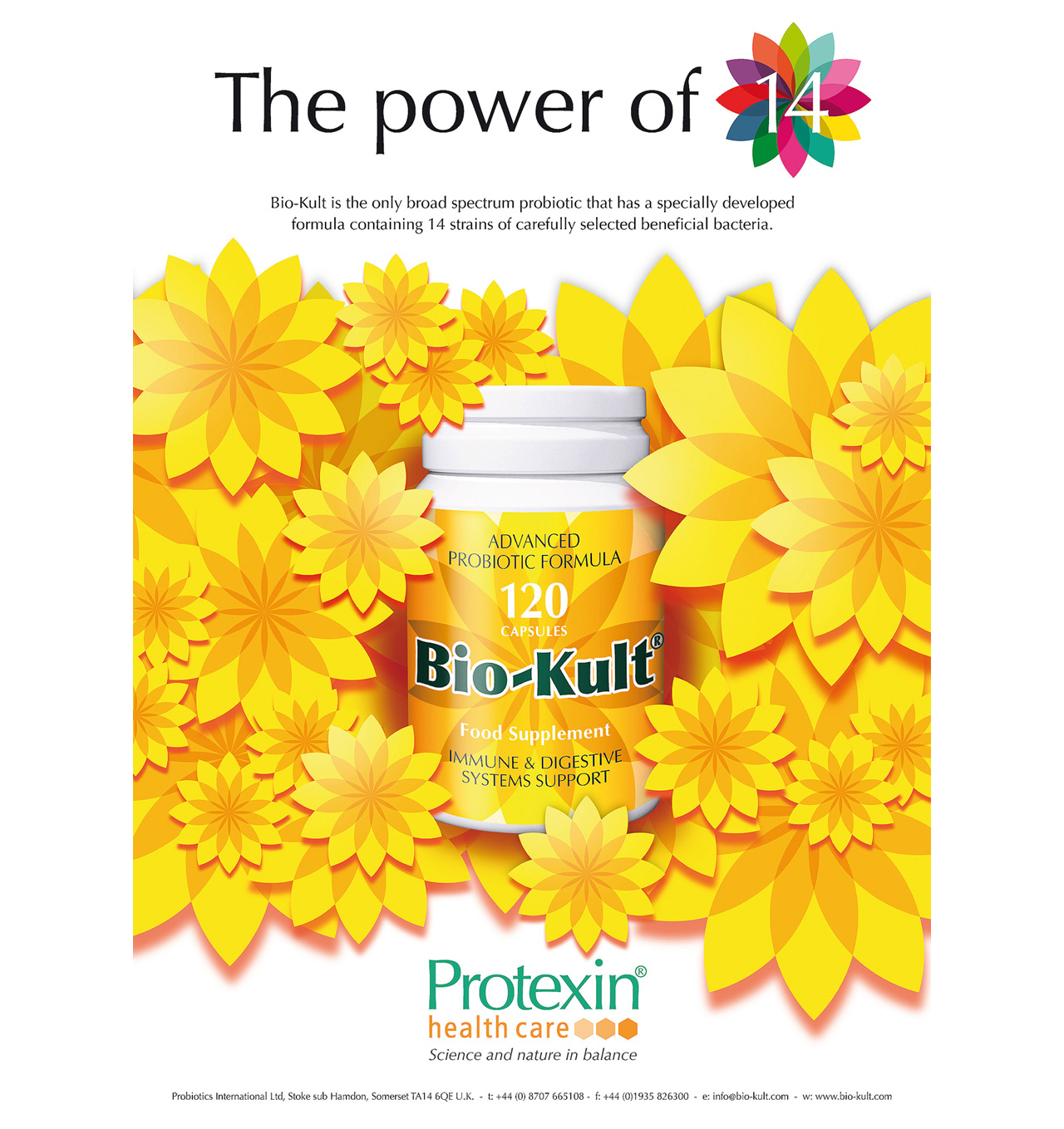
The term microflora sparks the idea for
a motif to express the core attribute of the product
Microflora refers to the many different kinds of bacteria that live in the gut for the purpose
of digestion and absorption of nutrients. Bio-Kult contains 14 different strains within the bacterial spectrum.
The blend is designed to enhance the performance of the digestive system.
Flora and spectrum combine to convey this product attribute in this eye-catching motif.
In turn, the idea formed the basis on which the new bottle label was designed.

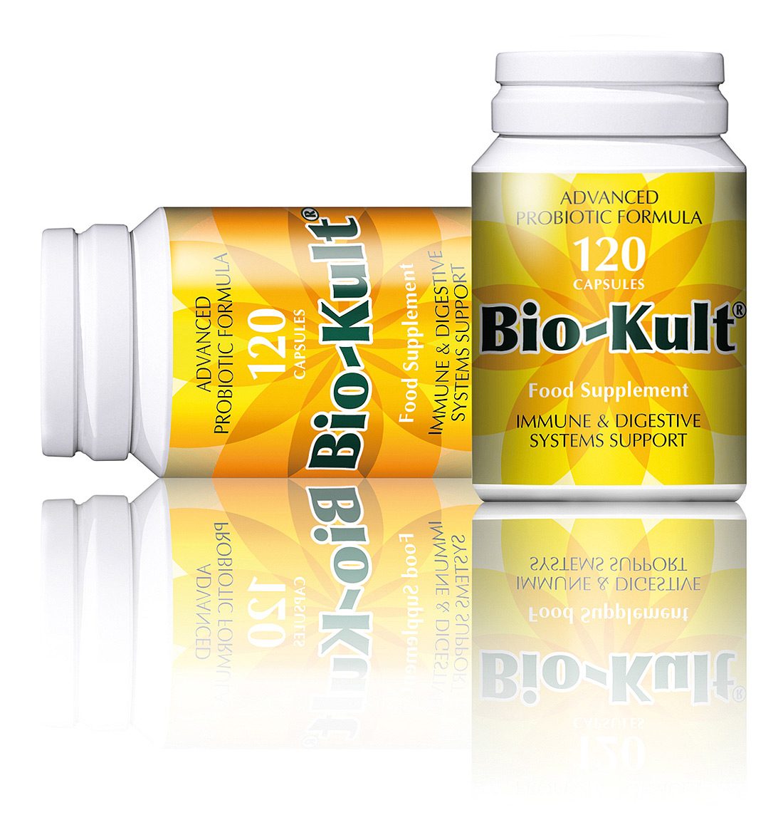
Unique, relevant, noticeable, attractive and clinical too
The completed Bio-Kult labels, applied to a bright white container
radiates all the values that are desired in a food supplement.
The background illustration of a flower with translucent petals looks clean,
healthy and also very precise and clinical. The feel of the existing name style
is retained, as is the colour palette.
Brand advertising with flower power
Advertising legislation in the UK quite rightly has as very strict rules for food supplement products.
No specific health or medical claims can be made.
The conceptual approach taken in developing print advertising was to use imagery
convey the feel of the marketing message of blossoming health.
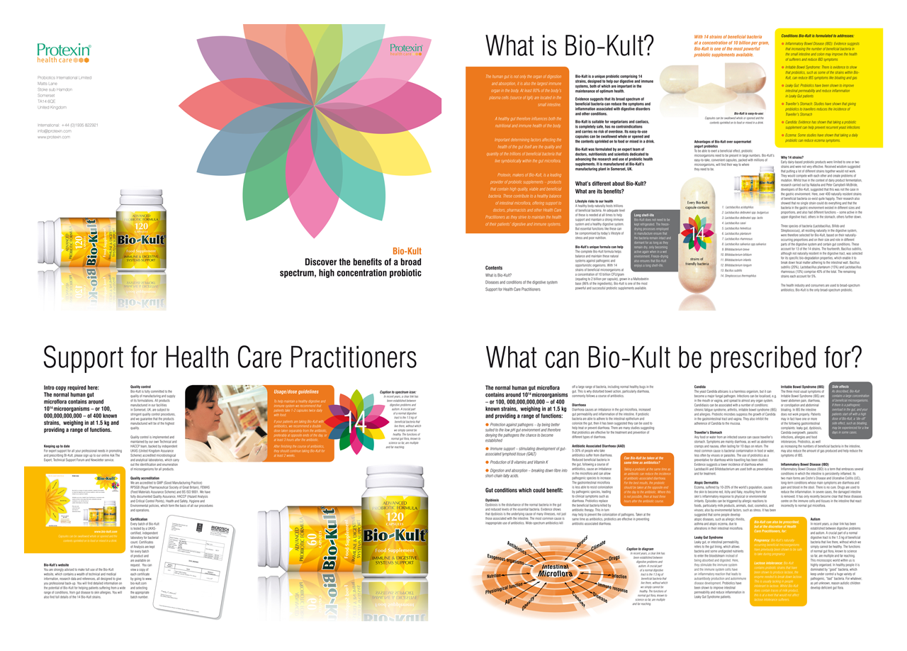
The label graphics grow into a full design scheme
This product brochure targets healthcare professional with a clean and well structured proposition.
All the potential benefits of the product are explained clearly. Clarity and organisation of the information is facilitated
within the page design by the spectrum colour palette and the product packaging.
Synergy across all collateral
maintains the health of the Bio-Kult brand
The core design elements performed effectively
when applied across the full range of marketing collateral.
From label to marketing literature, from banner to sales brochures,
from newsletter to exhibition stand and website design.
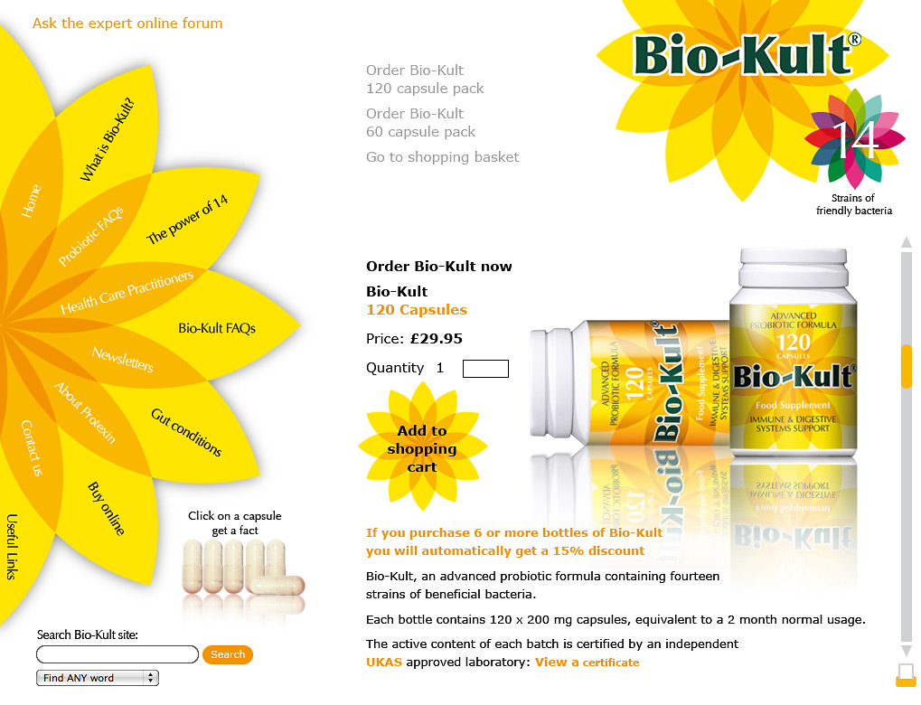
A unifying theme for a substantial website
The flower image was developed to form a website navigation device
and had the secondary function of branding a website that grew to well over 38-pages.
Flowers powered the new Bio-Kult brand
to success and significant increases in sales
The microflora inspired branding theme and iconography
powered Bio-Kult to a prominent position in its product category.
Brandgarden were asked to explore the feasibility of extending the brand elements across
a full range of human healthcare probiotic products. The pack designs show below are the result.
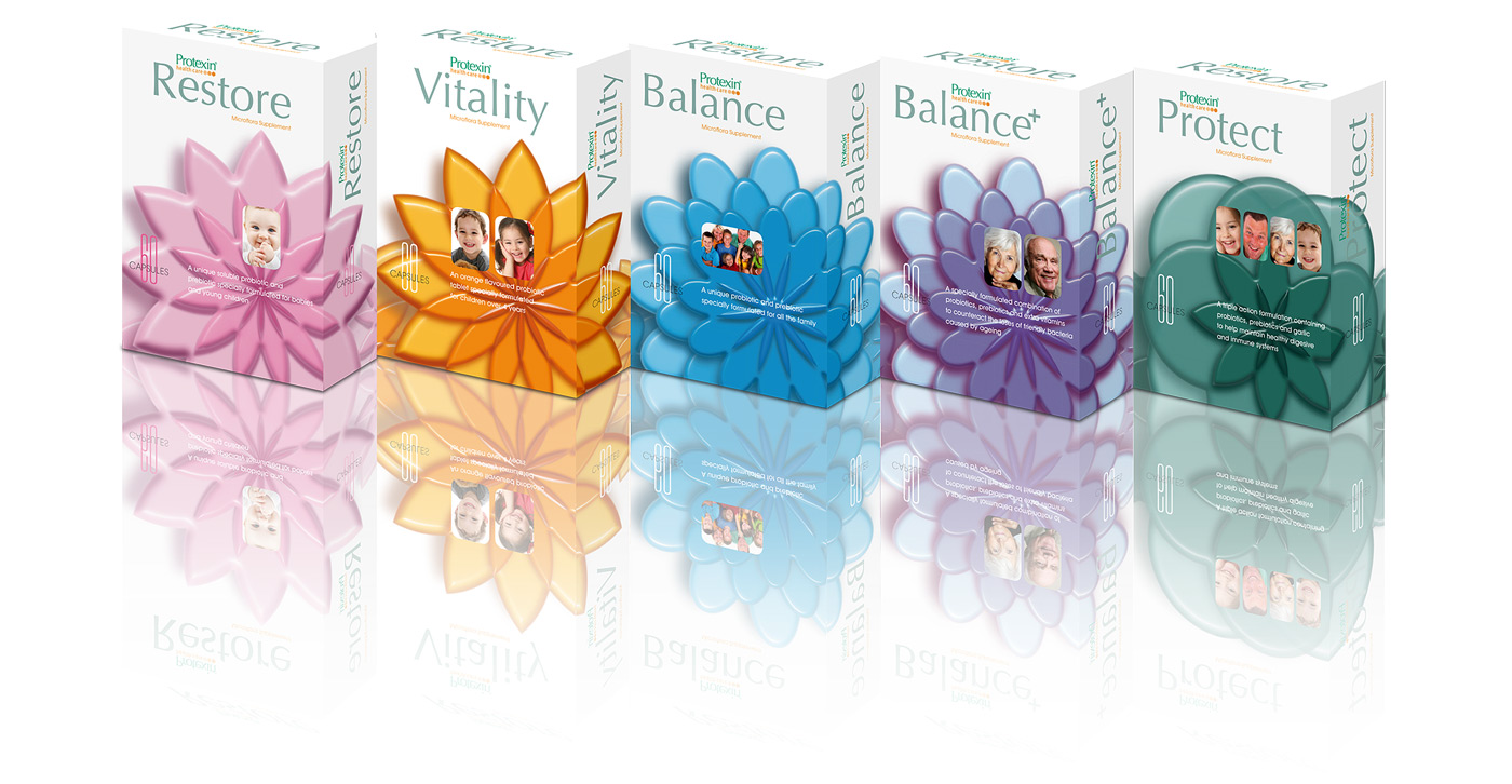
The Bio-Kult range is still growing today
Now, several years on, the two ideas have merged into one.
The success of the original Bio-Kult branding campaigns pushed the name to greater prominence than Protexin.
Today, the Bio-Kult brand name and floral theme is being used across a full range of six products

Make a dog wind-surf and sky-dive

Train women to do the unexpected

Knocking on the past to build a future